From microbrowser to touchscreen · 1999–present
A browser for six lines of text
At the end of the 1990s, a mobile phone was still primarily a telephone. Its screen was small and monochrome, the connection managed only a few kilobits per second and input happened through number keys. An ordinary web page full of large images, tables and JavaScript would not fit. Manufacturers and mobile operators nevertheless wanted to make news, weather, share prices, email and banking available on the move.
Their answer was WAP: the Wireless Application Protocol. A so-called microbrowser did not request ordinary HTML, but compact pages written in WML. A WAP gateway often sat between the handset and the service, translating and compressing data for the mobile network. It resembled browsing — opening an address, selecting links and going back — but it was a separate, much smaller Web.
Compact text and simple menus written in WML.
Converts the data and sends it across the telephone network.
Shows a few lines and accepts choices through a roller or key.
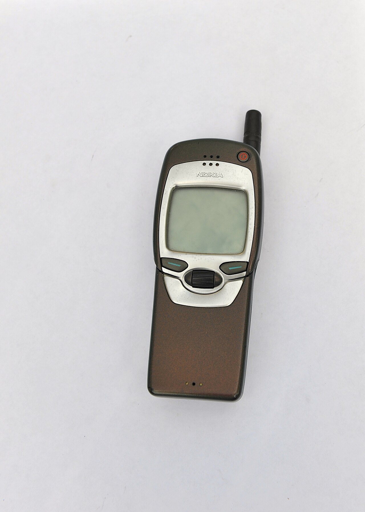
The Nokia 7110 gave that promise a recognisable device in 1999. Its Navi Roller was useful for vertical menus, but the network remained the brake. Establishing a connection took time, data arrived slowly and the meter often ran by the minute. Choosing the wrong menu meant another wait. The nickname “Wait And Pay” was unkind, but captured the experience rather well.
A portal instead of the entire internet
WAP services usually began at a menu run by the mobile operator. Users chose from selected news, ringtones, sports results, travel information or banking. That brought clarity and control, but it also created a walled garden. You could not automatically reach every website, and the operator determined which services appeared in the main menu.
Special WML pages, operator portals and simple text menus for small screens.
A browser processes ordinary HTML, CSS and JavaScript and adapts the page to the display.
Opera Mini let the server do the heavy work
Not every handset could run a complete browser. Opera therefore chose a clever detour in 2005. Opera Mini was a small Java application on the phone; an Opera server fetched the real web page, processed it and returned a much smaller result. The handset did not have to understand all the HTML, images and scripts itself.
That difference mattered when mobile traffic was still billed by the kilobyte. At the worldwide release in January 2006, Opera said pages could be reduced by as much as 80 per cent and reformatted for a narrow screen. The result was not always identical to a desktop browser, but it gave ordinary Java phones access to far more than a preselected portal.
The iPhone made the page touchable
Apple presented the iPhone on 9 January 2007 as a phone, iPod and “internet communications device” in one. Safari on the iPhone used the same WebKit family as the Mac. Instead of a separate WAP menu, the browser could display ordinary web pages. A tap zoomed in; two fingers changed the scale. Turn the phone and the page turned with it.
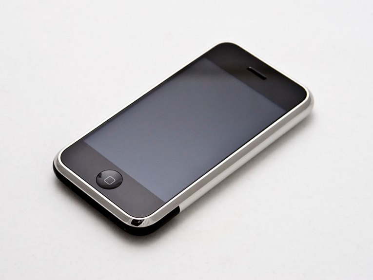
The browser had limitations. Flash was absent, the first handset used EDGE away from Wi-Fi and desktop sites produced tiny letters until you zoomed. Yet the premise had changed. The phone no longer had to settle for a derivative mobile service; the website itself had to learn how to handle a smaller display and a finger instead of a mouse.
A focus frame jumps along links and menu options.
Tapping, swiping, pinching and rotating make content directly manipulable.
Android made mobile browsing diverse
In November 2007, the Open Handset Alliance announced Android as an open mobile platform. The first commercial Android phone, the T-Mobile G1 of 2008, still combined a touchscreen with a slide-out keyboard. Its built-in browser also relied on WebKit. Manufacturers could place Android on many different handsets and browser makers could offer their own applications.
The browser contest thereby moved into the app store. Android Browser, Chrome, Firefox, Opera Mini and browsers made by handset companies competed on the same device. Meanwhile, growing numbers of websites offered an application alongside their site. Mobile users now chose not only a browser, but sometimes between the Web and an app.
Open without installation, easy to share and in principle accessible from every platform.
Installation, notifications and access to functions provided by phone and app store.
The website learned to move
The first reaction to smartphones was often a separate mobile site: an address such as m.example.com, with less text and smaller images. It worked, but meant maintaining two versions. Displays also kept multiplying: small phones, larger smartphones, tablets, laptops and wide monitors.
In May 2010, web designer Ethan Marcotte gave a more durable answer its name: responsive web design. A flexible grid, scalable images and CSS media queries let one page respond to the available space. The properties of the window, rather than the brand of phone, determine how columns, navigation and images are arranged.
Widths become proportions instead of fixed pixels.
Images no longer grow beyond their available space.
CSS changes the layout as the window becomes narrower or wider.
“Mobile” therefore ceased to be a separate destination. It became a state in which the same website could find itself. Designers also began to think mobile first: start with the essentials on the smallest screen, then add space and capabilities when they become available.
The browser almost disappeared into daily life
On a desktop, the browser was a visible program that you deliberately opened. On a phone it sits between almost everything: a link in a message, a search result, a QR code, a news card or an embedded window inside an app. The address bar may disappear while you scroll and many people scarcely notice which browser engine renders the page.
The old question nevertheless remains. Who decides which web technology works, which standard is supported and which browser is preinstalled? On a phone, Apple, Google, handset makers, app stores and mobile networks join browser makers in exercising that influence. The window onto the Web has grown smaller, but the power around it has not.